
In the rapidly evolving landscape of IT and AI-driven business, a brand’s visual identity serves as its digital handshake. Many tech startups and established firms fall into the trap of prioritizing aesthetic trends over functional scalability, leading to a disconnect between their sophisticated back-end and their front-end perception. Professional brand design requires a strategic alignment of psychology, technical constraints, and market positioning. When design fails, it doesn’t just look bad; it creates a barrier to user trust and diminishes the perceived value of the underlying technology.
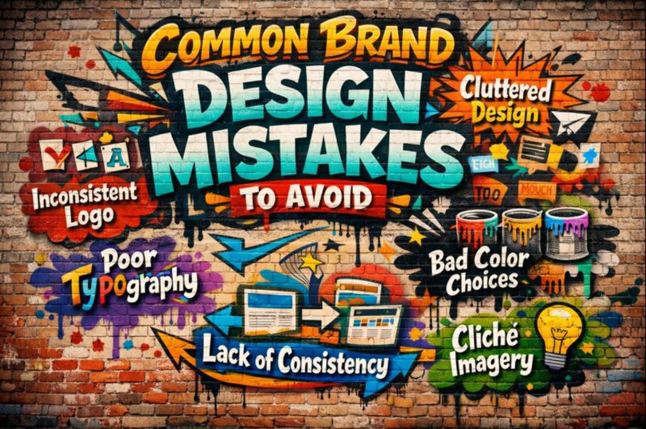
Overcomplicating the Visual Identity
Complexity is often the enemy of recognition, especially in a digital-first world where logos must remain legible on tiny smartphone screens and favicons. High-concept designs that attempt to tell the entire company history in one symbol usually result in visual noise that confuses the target audience.
The Scalability Issue A logo that looks stunning on a 27-inch monitor may become an unrecognizable smudge when reduced to a mobile app icon or a printed business card. Maintaining simplicity ensures the brand remains identifiable across all hardware specifications and resolutions.
Cognitive Overload When a design contains too many competing elements, the human brain struggles to process the core message, leading to lower brand recall. Streamlining elements allows for a more immediate and lasting emotional connection with the user.
Neglecting Brand Consistency Across Platforms
Inconsistency is one of the most frequent errors in IT branding, where the website looks futuristic but the software UI feels like a legacy system from the early 2000s. A fragmented brand experience suggests a lack of internal organization and can lead to significant user skepticism regarding product quality.
Fragmented User Experience When colors, fonts, and tone of voice vary between a social media ad and the actual product interface, users feel a sense of “digital vertigo.” Uniformity across all touchpoints builds a sense of reliability and professional rigor.
Dilution of Brand Equity Every time a brand presents a different version of itself, it loses a portion of its collective impact in the market. A centralized style guide is essential for keeping developers and designers aligned throughout the product lifecycle.
Ignoring the Psychology of Color and Typography
Designers often choose colors based on personal preference rather than the psychological triggers associated with the industry or the target demographic. In computer science and AI, color theory plays a vital role in conveying security, innovation, or accessibility to a global user base.
The Logic of Color Blue is frequently utilized in the IT sector because it subconsciously signals stability and trust, which is critical when handling sensitive data. Choosing an aggressive or mismatched palette can drive users away before they even read a single line of copy.
Typeface as a Voice Typography carries its own personality; a serif font might suggest tradition and academic depth, while a sans-serif font often feels modern and agile. Selecting a typeface that contradicts the brand’s mission creates a jarring experience for the reader.
Designing for Trends Instead of Longevity
Chasing the “design trend of the year” is a dangerous game for tech companies that want to be seen as industry leaders for decades. What looks cutting-edge today, such as specific gradient styles or glassmorphism, may look incredibly dated and “low-effort” in just a few short years.
The Trap of Modernity Relying on transient visual gimmicks forces a company into frequent, expensive rebrands that can alienate an existing loyal customer base. A timeless foundation allows a brand to evolve subtly without losing its core identity.
Sustainability in Design A brand built on fundamental design principles—balance, contrast, and hierarchy—will always outlast a brand built on a viral aesthetic. Investing in longevity ensures that the brand remains relevant even as the underlying technology shifts.
Failing to Account for Accessibility
In the modern tech ecosystem, ignoring accessibility (A11y) is not just a design mistake; it is a business failure that excludes millions of potential users. Brands that prioritize “cool” aesthetics over readable contrast ratios and inclusive design patterns often face backlash and legal challenges.
Color Contrast Standards Low-contrast text might look sleek to a designer with perfect vision, but it renders the content invisible to users with visual impairments. Adhering to WCAG guidelines is a hallmark of a professional, user-centric brand.
Inclusive Imagery A brand that fails to reflect a diverse range of users in its visual assets can feel exclusionary and out of touch with global reality. Representation in design fosters a broader community and expands the brand’s market reach.
Overlooking the Power of White Space
Crowding a layout with information, icons, and buttons is a common mistake that stems from the fear of “wasted space.” In reality, white space (or negative space) is a powerful tool that directs the user’s eye and gives the brand a premium, organized feel.
Enhancing Readability Proper use of negative space allows the content to breathe, making it easier for users to digest complex technical information. It reduces the “bounce rate” by making the interface feel manageable rather than overwhelming.
Luxury and Authority Generous spacing is often associated with high-end brands and authoritative voices in the technology sector. It signals that the brand is confident enough in its message that it doesn’t need to shout for attention.
Misaligning Brand Values with Visuals
A brand is more than a logo; it is a promise of value, and if the visuals don’t match the company’s actual ethics or capabilities, it creates “brand friction.” For instance, an AI company focused on ethics shouldn’t use aggressive, dark, or secretive visual language.
Authenticity in Design The visual identity must be a true reflection of the company’s culture and technical mission statement. When there is a gap between what a company says and how it looks, the audience perceives it as a lack of integrity.
Target Audience Alignment Designing for an enterprise-level CTO requires a different visual vocabulary than designing for a Gen Z developer. Misunderstanding the audience’s visual expectations leads to a brand that fails to resonate with the right people.
Poor Execution of Logo Versatility
A common technical error is creating a logo that works only in full color or on a white background, ignoring the realities of dark mode and monochrome printing. In the IT world, where dark mode is a standard user preference, a brand must be adaptable to multiple environments.
Dark Mode Optimization With the rise of system-wide dark modes, a brand must have a variant that maintains its integrity and vibrancy against dark gray or black backgrounds. Failing this makes the brand look like an afterthought in modern software ecosystems.
Monochrome Utility There are still many instances—from physical hardware engravings to certain document types—where a logo must work in a single color. A design that relies solely on color gradients to be legible is fundamentally flawed from a technical standpoint.
Underestimating the Importance of Iconography
Icons are the shorthand of the digital world, and using generic, “stock” looking icons can make a sophisticated software product look cheap and unoriginal. Custom iconography that matches the brand’s specific stroke weight and style adds a level of polish that users notice.
Visual Vocabulary Custom icons act as a secret language between the brand and the user, reinforcing the unique identity of the software. They provide a cohesive look that generic icon sets simply cannot replicate.
Functional Clarity Icons must be intuitive; a “clever” icon that no one understands is a failure of both design and utility. Balancing unique brand style with universal recognition is the key to successful iconographic systems.
Statistics
- 94% of first impressions are design-related, emphasizing the need for professional visual standards.
- 80% of consumers believe that color increases brand recognition by a significant margin.
- 33% of the top 100 brands use the color blue, highlighting its dominance in corporate trust-building.
- 45% of consumers will unfollow a brand if its visual content is poorly designed or unprofessional.
- 73% of companies that prioritize design outpace their competitors in terms of revenue growth.
- 10 seconds is the average time a person takes to form a first impression of a logo.
- 2.1x higher returns are seen by companies that integrate design thinking into their core business strategy.
Case Study: The “Tech-Sync” Rebrand
Scenario: A mid-sized AI analytics firm, Tech-Sync, suffered from a high churn rate despite having superior technology. Their original branding used a complex, multi-colored atom logo with thin, difficult-to-read typography. The Intervention: The company shifted to a “minimalist-functional” approach. They reduced the logo to a bold, single-stroke geometric shape and adopted a high-contrast navy and neon-green palette. The Result: Within six months of the rollout, user engagement on their dashboard increased by 28%. Users reported that the software “felt more powerful and secure,” proving that the visual change directly impacted the perception of the technical performance.
Common Mistakes
- Using Stock Templates: Relying on generic designs that make your company look like every other startup in the sector.
- Ignoring Feedback: Designing in a vacuum without testing how the target audience actually perceives the visuals.
- Poor Font Pairing: Combining two highly decorative fonts that clash and make the text unreadable.
- Lack of Style Guide: Failing to document brand rules, leading to “design drift” as the company grows.
FAQ
How often should a tech brand update its design? Ideally, a brand should undergo a “refresh” every 3-5 years to stay current, but a full “rebrand” should only happen if the company’s core mission or audience shifts significantly.
Can I use more than three main colors in my brand palette? While possible, it is extremely difficult to maintain consistency with a large palette. Stick to one primary, two secondary, and a few neutral colors for the best results.
Does a logo really need to work in black and white? Yes. Whether for invoices, faxing, or certain types of physical branding, a logo that fails in monochrome is technically incomplete.
Conclusion
Building a brand in the technology and computer science sector requires a delicate balance between artistic expression and technical precision. By avoiding the pitfalls of overcomplication, inconsistency, and trend-chasing, companies can create a visual identity that not only looks professional but also serves as a functional asset for growth. A strong brand acts as a bridge between complex code and human connection, ensuring that your innovation is presented with the clarity and authority it deserves.