
Visual hierarchy is one of the core principles that shapes how users read, understand, and interact with digital content. Whether you are designing a website, an app interface, or even a blog article, visual hierarchy determines what people notice first and how their eyes move across the screen. This article explains the concept in a practical, professional way for beginners who want to understand how it works and why it matters in modern digital experiences.
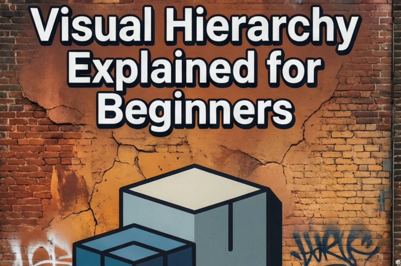
Understanding Visual Hierarchy
Visual hierarchy refers to arranging elements in a way that clearly shows their order of importance. Designers use it to guide attention from the most important element to the least important one. When hierarchy is clear, users can scan content quickly and understand it without effort. Poor hierarchy, on the other hand, creates confusion and increases cognitive load. In digital products, this can directly affect engagement and conversions.
Clear perception
The human brain processes visuals faster than text, which makes hierarchy essential. Size, color, contrast, and position help the brain decide what matters first.
Intentional design
Visual hierarchy is never accidental. Every element is placed with a purpose to support communication goals.
Why Visual Hierarchy Matters in Digital Content
In magazines, blogs, and tech websites, users rarely read word by word. They scan. Visual hierarchy helps them find value quickly. A strong hierarchy improves readability, reduces bounce rates, and increases time on page. For content-driven platforms, this directly impacts SEO and user satisfaction. Without hierarchy, even high-quality content can feel overwhelming.
User attention control
Hierarchy allows you to control where attention goes, especially in content-heavy layouts.
Faster decision-making
When information is structured visually, users make decisions more confidently and quickly.
Size and Scale as a Core Signal
Larger elements naturally draw more attention than smaller ones. Headlines, hero sections, and featured images rely heavily on size to establish importance. In beginner-friendly designs, size differences should be obvious but not extreme. Consistent scaling across pages helps users build familiarity and trust. When everything is the same size, nothing stands out.
Headline dominance
Large headings signal the main message instantly and anchor the page visually.
Supporting elements
Smaller text and visuals provide context without competing for attention.
Color and Contrast in Visual Flow
Color is one of the strongest tools in visual hierarchy. High-contrast elements stand out first, while muted tones recede into the background. Designers often use brand colors to highlight key actions or messages. However, overusing bright colors can reduce their impact. Balanced contrast ensures clarity without visual fatigue.
Focus through contrast
Strong contrast directs attention to critical elements like calls to action.
Emotional influence
Color also shapes emotional response, reinforcing hierarchy subconsciously.
Typography and Readability
Typography plays a major role in how hierarchy is perceived. Font weight, style, spacing, and alignment all affect how text is scanned. Clear typographic hierarchy helps users understand structure instantly. Beginners should focus on using limited font families and consistent styles. Simplicity improves comprehension and professionalism.
Font weight variation
Bold text highlights importance without changing layout complexity.
Line spacing control
Proper spacing improves readability and supports visual rhythm.
Layout, Alignment, and Spacing
Layout determines how elements relate to each other spatially. Alignment creates order, while spacing defines relationships. White space is not empty space; it is a functional tool that improves clarity. A well-spaced layout feels modern and easier to understand. Crowded designs often signal poor hierarchy.
Logical grouping
Related elements placed close together are perceived as connected.
Breathing room
White space allows important elements to stand out naturally.
Visual Hierarchy in UI and UX Design
In user interfaces, visual hierarchy directly affects usability. Buttons, navigation, and feedback messages must be instantly recognizable. UX designers rely on hierarchy to reduce errors and guide actions. For beginners, studying common patterns like dashboards and mobile apps helps build intuition. Consistency across screens reinforces learning.
Action prioritization
Primary actions must always be visually dominant.
Error prevention
Clear hierarchy reduces confusion and misclicks.
Real-World Study Case Example
A mid-sized online magazine redesigned its article pages to improve readability. Before the redesign, all headings looked similar, and spacing was minimal. After applying clear visual hierarchy—larger headlines, better spacing, and improved contrast—average time on page increased significantly. Bounce rates dropped, and mobile engagement improved. This example shows how hierarchy directly impacts user behavior.
Before optimization
Users struggled to scan content and often left early.
After optimization
Clear structure guided reading and improved engagement metrics.
Visual Hierarchy and SEO Performance
Search engines prioritize user experience signals such as dwell time and readability. Proper visual hierarchy supports these signals indirectly. Clear headings improve content structure for both users and search engines. Well-organized content is more likely to be featured in rich results. For bloggers and magazines, hierarchy is both a design and SEO asset.
Content clarity
Structured layouts help search engines understand content relevance.
User signals
Better hierarchy leads to longer sessions and lower bounce rates.
Statistics
- Users form a first impression of a website in about 50 milliseconds.
- Well-structured visual hierarchy can improve content readability by over 40%.
- Around 79% of users scan pages instead of reading them fully.
- Clear typography hierarchy can increase comprehension by nearly 30%.
- Mobile users are 5 times more likely to abandon a site with poor visual structure.
- Pages with strong visual hierarchy show higher engagement rates across devices.
- Consistent layout patterns improve user task completion rates significantly.
The Most Common Mistakes
Many beginners try to emphasize everything at once, which removes hierarchy completely. Overusing colors and fonts creates visual noise. Ignoring white space leads to crowded layouts that overwhelm users. Inconsistent heading styles confuse readers and weaken structure. Another common mistake is designing only for desktop and neglecting mobile hierarchy.
Frequently Asked Questions
Is visual hierarchy only important for designers?
No, writers, developers, and marketers all benefit from understanding visual hierarchy because it affects communication and conversion.
Can visual hierarchy improve content performance?
Yes, it improves readability, engagement, and user satisfaction, which indirectly boosts SEO performance.
How can beginners practice visual hierarchy?
By analyzing well-designed websites, using simple layouts, and testing content with real users.
Does visual hierarchy differ between web and mobile?
The principles are the same, but mobile requires stronger prioritization due to limited space.
Conclusion
Visual hierarchy is a foundational concept that shapes how users experience digital content. For beginners, understanding and applying it can dramatically improve clarity, usability, and engagement. It bridges design, content, and technology into one coherent experience. In magazine and tech-focused websites, mastering visual hierarchy is not optional—it is essential for success.