
Color is one of the most powerful non-verbal tools in branding. It influences perception, emotion, memory, and trust—often before a single word is read. In a crowded digital and physical marketplace, color can be the fastest way for a brand to be recognized, remembered, and preferred. This article explores how color builds brand recognition from a professional branding and marketing perspective.
The Psychology of Color in Branding
Color directly affects human emotions and decision-making. Brands that understand color psychology can trigger specific feelings aligned with their identity. This emotional connection helps brands stay memorable over time. Research shows that people form an opinion about a product within seconds, and color plays a major role in that judgment. When emotions and visuals align, recognition becomes automatic. Strong brands use color consistently to reinforce this psychological impact.
Emotional Triggers
Warm colors often evoke excitement and energy, while cool colors suggest calm and trust. Choosing the right emotional trigger depends on the brand’s core message.
Cognitive Association
Over time, the brain links certain colors with specific brands, creating instant recognition without conscious effort.
Color and Visual Memory
Humans remember visuals far better than text alone. Color strengthens memory retention and recall, making brands easier to recognize later. A consistent color palette helps the brain store brand information efficiently. This is why people can recognize brands from color alone, even without logos. Visual memory driven by color is especially powerful in advertising and packaging. Brands that ignore this lose long-term recall.
Long-Term Recall
Consistent color use improves the chances that customers will remember a brand days or even weeks later.
Instant Recognition
Seeing a familiar color can trigger immediate brand recall without reading any text.
Consistency Across Brand Touchpoints
Consistency is critical for building recognition. When the same colors appear across websites, apps, packaging, and social media, trust grows. Inconsistent color usage confuses audiences and weakens brand identity. Strong brands treat color as a system, not decoration. This unified visual language creates familiarity. Familiarity leads to preference.
Digital Presence
Websites, apps, and social platforms must maintain identical color standards to reinforce recognition.
Offline Materials
Packaging, signage, and printed materials should match digital colors to avoid visual dissonance.
Color and Brand Personality
Every brand has a personality, whether intentional or not. Color helps define whether a brand feels bold, friendly, luxurious, or professional. Consumers subconsciously judge brands based on color choices. The right palette communicates values without explanation. When personality and color align, brand recognition feels natural. When they clash, trust declines.
Tone of Voice Through Color
Bright colors often suggest playfulness, while muted tones communicate sophistication.
Market Positioning
Premium brands often use restrained palettes, while mass-market brands favor high contrast.
Cultural Impact of Color Choices
Color meanings vary across cultures. A color that signals success in one region may signal warning in another. Global brands must adapt color strategies carefully. Ignoring cultural context can damage recognition and credibility. Localization does not mean losing identity; it means translating it visually. Smart brands research before expanding.
Regional Interpretation
Cultural symbolism affects how colors are emotionally received by different audiences.
Global Brand Adaptation
Some brands slightly adjust shades while maintaining core identity worldwide.
Color in Digital Branding and UX
In digital products, color guides attention and behavior. It helps users understand hierarchy, actions, and feedback. Strong brand colors improve usability while reinforcing identity. Poor color contrast can harm both recognition and accessibility. Modern brands balance aesthetics with function. UX-driven color systems increase engagement and recall.
Interface Hierarchy
Primary brand colors highlight key actions and important information.
Accessibility and Trust
Readable, accessible colors increase user confidence and brand credibility.
Competitive Differentiation Through Color
In saturated markets, color can be a key differentiator. Choosing a distinctive palette helps brands stand out instantly. Many successful brands own a color category in their industry. Differentiation reduces the need for explanation. When competitors look similar, color becomes a strategic advantage. This uniqueness drives faster recognition.
Category Ownership
Some brands become synonymous with a specific color in their market.
Visual Contrast
Standing out visually increases attention and memorability in crowded spaces.
Case Study: Coca-Cola and Red
Coca-Cola is one of the strongest examples of color-driven brand recognition. The brand’s consistent use of red for over a century has created instant global recognition. Even without the logo, the red color alone often signals Coca-Cola. This consistency across packaging, advertising, and sponsorships reinforced emotional associations with energy and happiness. The result is one of the most recognizable brands in the world, largely powered by color.
Historical Consistency
Coca-Cola rarely deviated from its core red, strengthening long-term recognition.
Emotional Branding
The red color supports feelings of excitement, celebration, and togetherness.
Measuring the Impact of Color on Recognition
Color impact can be measured through brand recall studies, A/B testing, and user surveys. Data-driven branding decisions outperform intuition alone. Metrics help brands refine palettes over time. Recognition is not just visual—it affects conversion and loyalty. Brands that measure color performance gain a competitive edge.
Brand Recall Testing
Surveys can measure how well audiences associate colors with specific brands.
Conversion Influence
Color changes can directly impact click-through rates and purchase behavior.
Statistics
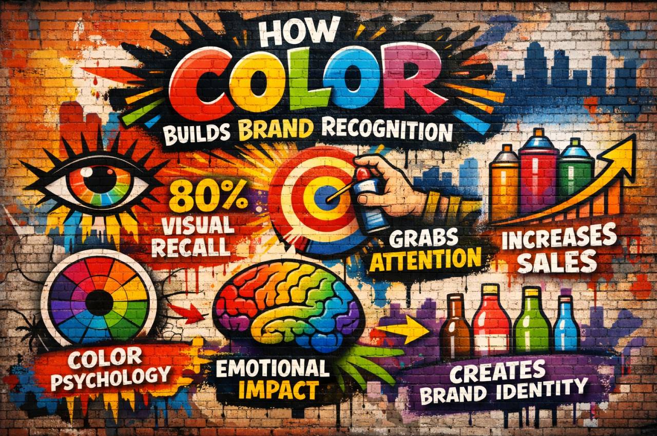
- Color increases brand recognition by up to 80%, according to branding research studies.
- People make subconscious judgments about products within 90 seconds, and up to 90% of that assessment is based on color.
- Consistent brand presentation, including color, can increase revenue by more than 20%.
- Ads in color are read up to 42% more often than similar ads in black and white.
- Brands using a signature color can improve recognition by more than 60% compared to inconsistent palettes.
- Visual information is processed 60,000 times faster than text, making color a critical branding tool.
- Over 85% of consumers say color is a primary reason they choose one brand over another.
Common Mistakes in Using Color for Branding
Many brands choose colors based on personal taste rather than strategy. Others change colors too frequently, breaking recognition. Ignoring accessibility leads to poor user experience and lost trust. Some brands copy competitors instead of differentiating. Another common mistake is inconsistent color application across platforms. These errors weaken brand recognition over time.
Frequently Asked Questions
Can a brand change its colors without losing recognition?
Yes, but changes should be gradual and strategic, maintaining core visual elements.
Is one color better than multiple colors for branding?
Not necessarily; strong brands often use a primary color supported by a balanced palette.
Does color matter more than logo design?
Color and logo work together, but color often triggers recognition faster.
How do startups choose the right brand color?
By aligning target audience psychology, market positioning, and brand personality.
Do trends matter when choosing brand colors?
Trends can inspire, but long-term consistency is more important than short-term fashion.
Conclusion
Color is not a decorative choice—it is a strategic branding asset. It shapes perception, strengthens memory, and builds trust through consistency. Brands that invest in thoughtful color strategy gain faster recognition and stronger emotional connections. In a competitive digital world, owning a color can be as powerful as owning a name. When used correctly, color becomes a silent ambassador for the brand.