
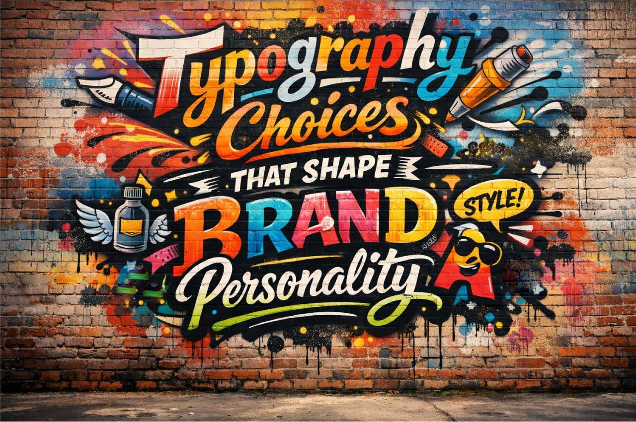
Typography is more than selecting a font; it is a strategic design decision that directly influences how a brand is perceived. In digital magazines, tech platforms, and AI-driven products, typography plays a silent yet powerful role in shaping trust, emotion, and usability. This article explores how typography choices define brand personality from a professional, design-oriented perspective.
Typography as a Brand Voice
Typography functions as a visual tone of voice, communicating emotion before a single word is read. Serif fonts often suggest authority and tradition, while sans-serif fonts convey clarity and modernity. In tech and AI-focused platforms, typography frequently replaces verbal branding cues. A well-chosen typeface aligns brand values with user expectations. Poor typography, however, creates confusion and weakens credibility. Brands that invest in typographic strategy gain stronger emotional resonance.
Emotional Signaling Through Fonts
Fonts can express confidence, friendliness, innovation, or seriousness without explanation. Users subconsciously interpret these signals within milliseconds.
Consistency Across Touchpoints
When typography remains consistent across websites, apps, and content platforms, brand recognition increases significantly.
Psychological Impact of Typeface Selection
Human psychology strongly responds to visual patterns, including letter shapes and spacing. Rounded typefaces often feel approachable, while sharp angles can feel technical or aggressive. In IT and computer science platforms, typography must balance precision with readability. A mismatch between content and typography can reduce engagement. Successful brands select typefaces that match user mindset and context.
Cognitive Load and Readability
Readable typography reduces mental effort, allowing users to focus on information rather than decoding text.
Trust and Perceived Authority
Professional typography increases perceived trustworthiness, especially in AI and data-driven environments.
Serif vs Sans-Serif in Digital Brands
The debate between serif and sans-serif fonts is not aesthetic alone; it is contextual. Sans-serif fonts dominate digital interfaces due to screen readability and modern appeal. Serif fonts, however, are still powerful in editorial and long-form content. Brand personality determines which direction is appropriate. Hybrid font systems are increasingly common.
When Serif Fonts Excel
Editorial platforms and knowledge-based brands benefit from serif fonts due to their traditional tone.
Why Sans-Serif Leads in Tech
Clean lines and scalability make sans-serif fonts ideal for dashboards, apps, and SaaS platforms.
Typography in AI and Technology Products
AI products rely heavily on user trust, and typography directly contributes to that trust. Clean, neutral fonts signal reliability and intelligence. Overly decorative fonts can undermine credibility in technical contexts. Many AI platforms adopt humanist sans-serif fonts to balance warmth and precision. Typography also affects how users perceive algorithmic transparency.
Humanizing Complex Technology
Typography can soften the perception of complex AI systems by appearing approachable.
Supporting Data Visualization
Clear fonts improve comprehension of charts, dashboards, and analytical interfaces.
Custom Fonts and Brand Differentiation
Custom typography allows brands to stand out in saturated digital markets. Large tech companies increasingly invest in proprietary fonts to reinforce identity. Custom fonts improve consistency and reduce dependency on third-party licenses. They also enhance brand memorability. However, they require careful optimization for performance.
Ownership and Brand Control
Custom fonts give brands full control over visual identity across platforms.
Performance and Accessibility Considerations
Optimized font files ensure fast loading and accessibility compliance.
Accessibility and Inclusive Typography
Inclusive typography ensures content is readable for users with visual or cognitive impairments. Font size, contrast, and spacing are critical accessibility factors. In AI and IT platforms, accessibility is no longer optional; it is a standard. Brands that prioritize inclusive typography demonstrate social responsibility. This directly impacts user retention and legal compliance.
Contrast and Legibility
High contrast between text and background improves readability for all users.
Dyslexia-Friendly Design
Certain font structures reduce reading difficulty for neurodiverse users.
Typography and User Experience Design
Typography is a core component of UX, not a decorative layer. Line height, font hierarchy, and spacing guide user attention. In content-heavy platforms, typography determines whether users stay or leave. UX-driven typography supports scanning, comprehension, and interaction. Poor typographic hierarchy leads to frustration.
Visual Hierarchy and Flow
Clear heading and body text relationships improve content navigation.
Micro-Typography Details
Kerning and letter spacing subtly influence comfort and professionalism.
Cultural and Global Typography Considerations
Global brands must consider cultural interpretations of typography. Certain fonts carry different meanings across regions. Multilingual platforms require typefaces that support multiple scripts without losing identity. AI-driven translation tools also rely on typographic compatibility. Cultural sensitivity in typography prevents miscommunication.
Localization Without Identity Loss
Well-designed font families maintain brand consistency across languages.
Script Compatibility
Supporting Arabic, Asian, and Latin scripts requires advanced typographic planning.
Typography Trends Shaping Modern Brands
Typography trends reflect technological and cultural shifts. Variable fonts, minimalism, and responsive typography are now mainstream. Brands that follow trends blindly risk losing identity. Strategic adoption is essential. Timeless typography outperforms short-lived design fads.
Variable Fonts in Responsive Design
Single font files adapting to multiple weights improve performance and flexibility.
Minimalism and Clarity
Simple typography aligns with modern digital expectations and faster consumption.
Statistics
Typography-driven brand recognition improves by approximately 30% when consistent fonts are used across platforms.
Users form a visual impression of a brand within 50 milliseconds, largely influenced by typography.
Sans-serif fonts improve screen readability by nearly 20% compared to serif fonts on digital interfaces.
Accessible typography can increase user retention rates by up to 25%.
Custom brand fonts can improve brand recall by around 15%.
Poor typography contributes to nearly 38% of users leaving a website due to readability issues.
Clear typographic hierarchy improves content comprehension by over 40%.
Study Case: Google’s Typography Strategy
Google introduced its custom font, Roboto, to unify its ecosystem across Android, web, and AI products. The goal was to balance mechanical precision with human warmth. Roboto improved readability on screens of all sizes and reinforced Google’s modern, accessible brand image. Over time, the font became a silent yet powerful branding asset across billions of devices. This case demonstrates how strategic typography supports scalability and trust in technology-driven brands.
Frequently Asked Questions
How does typography affect brand trust in AI platforms?
Typography influences perceived reliability and professionalism, especially in complex technical environments.
Can typography really impact conversion rates?
Yes, readable and emotionally aligned typography improves engagement and decision-making.
Is custom typography necessary for startups?
Not mandatory, but a strong font system can significantly enhance differentiation.
How often should brands update their typography?
Only when brand strategy or audience expectations change, not based on trends alone.
Does typography impact SEO?
Indirectly, yes. Better readability improves engagement metrics that affect SEO performance.
Common Typography Mistakes
Using too many fonts within one brand ecosystem.
Ignoring mobile and responsive typography requirements.
Choosing trendy fonts that age quickly.
Poor contrast between text and background.
Neglecting accessibility and readability standards.
Conclusion
Typography is a foundational element of brand personality, especially in AI, IT, and computer science platforms. It shapes perception, builds trust, and enhances usability without drawing attention to itself. Brands that treat typography as a strategic asset, not a decorative choice, gain long-term consistency and credibility. In a digital-first world, typography speaks before content does.sing identity. Brands that invest in thoughtful logo design build stronger recognition, trust, and long-term value.