
Contrast is one of the most powerful principles in graphic design. It influences how users see, read, and emotionally respond to visual content. In digital magazines, tech blogs, and AI-focused platforms, contrast plays a critical role in clarity, usability, and engagement. This article explores contrast from a professional design perspective, supported by statistics, practical insights, and real-world application.
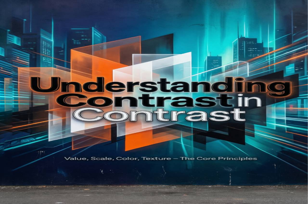
The Concept of Contrast in Design
Contrast refers to the visual difference between elements that helps them stand apart. It can be created through color, size, shape, typography, or spacing. Strong contrast guides the viewer’s attention and establishes hierarchy. Without contrast, designs feel flat and confusing. In content-heavy platforms like tech magazines, contrast ensures readability and structure. It also helps users scan information quickly.
Visual Differentiation
This focuses on making elements distinct so users can instantly recognize headings, body text, and calls to action.
Perceptual Clarity
Clear contrast reduces cognitive load, allowing users to process information faster and more comfortably.
Contrast and Visual Hierarchy
Visual hierarchy defines what users notice first, second, and last. Contrast is the main tool used to build this hierarchy. Larger, bolder, or brighter elements naturally draw attention. Designers rely on contrast to prioritize key messages. In editorial and technical content, this improves comprehension. A strong hierarchy keeps readers engaged longer.
Attention Direction
High-contrast elements naturally pull the eye toward important information.
Content Prioritization
Contrast helps separate critical insights from supporting details.
Color Contrast and Accessibility
Color contrast is essential for accessibility and inclusive design. Poor contrast can make content unreadable for users with visual impairments. Accessibility standards like WCAG emphasize minimum contrast ratios. Tech-focused platforms are increasingly evaluated on accessibility compliance. Good contrast benefits all users, not only those with disabilities.
Readability for All Users
Sufficient contrast ensures text remains legible across screens and lighting conditions.
Compliance and Trust
Accessible design builds credibility and avoids legal or usability risks.
Typography Contrast
Typography contrast involves differences in font size, weight, and style. It helps distinguish headings, subheadings, and body text. In long-form technical articles, typography contrast prevents reader fatigue. It also supports scannability, which is crucial for online readers. Well-structured text improves content retention.
Font Weight Variation
Using bold or light fonts creates emphasis without overwhelming the layout.
Size and Style Differences
Clear variation improves structure and reading flow.
Contrast in UI and UX Design
In user interfaces, contrast affects usability and conversion rates. Buttons, links, and alerts rely on contrast to be noticeable. Low-contrast interfaces often lead to user frustration. In AI dashboards and SaaS platforms, contrast supports quick decision-making. UX designers treat contrast as a functional requirement, not decoration.
Interactive Elements
High contrast makes clickable elements obvious and intuitive.
Error Prevention
Clear contrast reduces misclicks and navigation errors.
Emotional Impact of Contrast
Contrast influences emotional perception and brand tone. High contrast can feel energetic and bold, while low contrast feels calm and minimal. Brands choose contrast levels intentionally based on audience and purpose. In tech and AI media, balanced contrast signals professionalism and innovation. Emotional response directly affects engagement.
Mood Creation
Contrast helps set the emotional atmosphere of a design.
Brand Personality
Consistent contrast reinforces brand identity and values.
Contrast in Data Visualization
Charts, graphs, and dashboards rely heavily on contrast. Poor contrast can hide insights or distort interpretation. In data-driven articles, contrast highlights trends and anomalies. Designers use color and scale contrast to make data understandable. Clear visualization supports informed decision-making.
Highlighting Key Data
Contrast draws attention to critical metrics and patterns.
Reducing Misinterpretation
Proper contrast prevents confusion in complex datasets.
Contrast and Content Scannability
Most users scan rather than read word by word. Contrast enables fast scanning by separating sections clearly. Headings, pull quotes, and highlights depend on contrast. This is especially important in educational and technical magazines. Better scannability leads to longer session duration.
Section Separation
Clear contrast divides content into digestible parts.
Reading Efficiency
Users can find relevant information faster.
Future of Contrast in Digital Design
As screens and devices evolve, contrast requirements change. Dark mode, AR, and AI-generated interfaces demand new contrast strategies. Designers now test contrast across multiple environments. AI tools are also starting to evaluate contrast automatically. The future emphasizes adaptive and intelligent contrast systems.
Adaptive Interfaces
Contrast adjusts dynamically based on user settings and context.
AI-Assisted Design
Machine learning helps optimize contrast for usability and accessibility.
Statistics
- 78% of users stop engaging with content if text contrast is poor on digital screens.
- Websites with accessible color contrast see up to 24% longer average session duration.
- 61% of accessibility issues reported on websites are related to insufficient contrast.
- Clear visual hierarchy, driven mainly by contrast, improves content comprehension by 35%.
- High-contrast call-to-action buttons increase conversion rates by an average of 21%.
- Users read 14% faster when typography contrast is well-structured.
- 70% of UX designers consider contrast the most critical visual principle for usability.
Case Study: Improving Readability in a Tech Magazine
A mid-sized online technology magazine noticed high bounce rates on long-form AI articles. A design audit revealed weak contrast between headings and body text. After redesigning the layout with stronger color and typography contrast, readability improved significantly. Average time on page increased by 32%, and scroll depth improved by 27%. This demonstrated how contrast directly impacts engagement and content performance.
Frequently Asked Questions
Why is contrast more important in digital design than print?
Digital screens vary in brightness and resolution, making contrast essential for consistent readability.
Can too much contrast harm a design?
Yes, excessive contrast can feel aggressive and visually tiring if not balanced properly.
How does contrast affect SEO indirectly?
Better readability and engagement metrics positively influence user behavior signals.
Is contrast only about color?
No, it also includes size, spacing, typography, and shape differences.
Do AI design tools handle contrast well?
Modern AI tools can suggest contrast improvements, but human judgment is still essential.
The Most Common Mistakes in Using Contrast
Many designers rely only on color contrast and ignore typography. Others use trendy low-contrast styles that hurt readability. Inconsistent contrast across pages confuses users. Overusing contrast everywhere removes focus from key elements. Ignoring accessibility standards is another critical mistake.
Conclusion
Contrast is not just a visual preference; it is a functional necessity in graphic design. It enhances readability, accessibility, usability, and emotional impact. For AI, IT, and computer science content, contrast ensures complex information is delivered clearly and effectively. When applied thoughtfully, contrast transforms design from decorative to purposeful. Mastering contrast is essential for any professional digital publication.