
Design is more than visual appeal; it is a discipline that blends communication, psychology, and usability. New designers often enter the field with strong creative passion but limited practical experience, which leads to recurring mistakes. These mistakes are normal, yet recognizing them early can dramatically accelerate professional growth. This article explores the most common design pitfalls, explains why they happen, and shows how to avoid them with a professional mindset grounded in real-world practice.
Ignoring the Design Brief
Many new designers jump straight into visuals without fully understanding the brief. This leads to designs that look good but fail to solve the actual problem. A design that does not align with business goals or user needs rarely succeeds, regardless of aesthetics. Understanding constraints, audience, and objectives is the foundation of professional design.
Lack of problem definition
When the problem is unclear, design decisions become random. Clear objectives guide layout, color, and typography choices.
Misalignment with client goals
Design that ignores KPIs, branding, or target users often gets rejected, wasting time and effort.
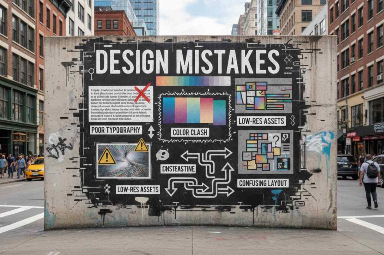
Poor Typography Choices
Typography is one of the strongest tools in design, yet it is commonly misused. New designers often rely on too many fonts or decorative typefaces that reduce readability. Good typography enhances clarity, hierarchy, and emotional tone without drawing unnecessary attention to itself.
Overusing fonts
Using more than two or three fonts creates visual noise and weakens brand consistency.
Ignoring readability
Small font sizes, low contrast, or tight line spacing make content difficult to consume.
Weak Visual Hierarchy
Visual hierarchy helps users understand where to look first and how to scan content. Beginners often treat all elements with equal importance, resulting in cluttered layouts. Strong hierarchy improves usability and communication efficiency.
No clear focal point
Without a dominant element, users feel lost and unsure what matters most.
Inconsistent spacing
Poor alignment and spacing break rhythm and reduce professional quality.
Overloading Designs with Elements
New designers sometimes equate complexity with creativity. This leads to overcrowded designs filled with icons, colors, and effects. Simplicity, when done correctly, is far more powerful and professional.
Fear of empty space
White space is often misunderstood, yet it improves focus and readability.
Too many visual effects
Excessive shadows, gradients, and animations distract rather than enhance.
Ignoring Color Theory
Color choices strongly affect perception and emotion. Beginners often choose colors based on personal preference rather than purpose. Professional design uses color strategically to guide attention and reinforce brand identity.
Poor contrast choices
Low contrast reduces accessibility and frustrates users.
Inconsistent color usage
Random color application weakens brand recognition and visual coherence.
Designing Without User Perspective
Design is not about the designer; it is about the user. New designers sometimes prioritize artistic expression over usability. This results in interfaces that look creative but are difficult to use.
Skipping user research
Without understanding user behavior, designs rely on assumptions.
Ignoring accessibility needs
Designs that overlook accessibility exclude large user groups.
Not Designing for Scalability
Beginners often design for one screen or scenario only. Professional design must scale across devices, platforms, and future content updates. Scalability ensures longevity and adaptability.
Fixed layouts
Designs that break on different screen sizes reduce usability.
No design system thinking
Lack of reusable components leads to inconsistency and maintenance issues.
Copying Trends Without Understanding
Design trends can inspire, but blindly following them is risky. New designers often imitate popular styles without understanding their purpose or context. Trends should support the message, not replace strategy.
Trend over function
Popular visuals may harm usability if misapplied.
Short-lived relevance
Trend-heavy designs often age quickly and require frequent redesigns.
Lack of Feedback and Iteration
Many beginners treat design as a one-time task. Professional design is iterative and improves through critique and testing. Feedback reveals blind spots and leads to better outcomes.
Avoiding critique
Defensive attitudes slow professional growth.
No testing phase
Untested designs often fail in real-world use.
Case Study
A junior designer created a landing page for a SaaS startup using six fonts, multiple gradients, and dense content blocks. Despite positive internal feedback, conversion rates were low. After simplifying typography, improving hierarchy, and aligning the design with user goals, conversions increased significantly within one month. This example highlights how clarity and usability outperform visual excess.
Statistics
- Studies show that users form an opinion about a website in less than 0.05 seconds.
- Nearly 70% of small business websites fail due to poor usability and design choices.
- Consistent visual hierarchy can improve content comprehension by over 40%.
- Accessible color contrast improves readability for approximately 15% of users with visual impairments.
- Simplified layouts can increase user engagement by up to 35%.
- Companies that invest in UX design see an average ROI of 9,900%.
- Over 60% of users abandon websites that are not mobile-friendly.
Frequently Asked Questions
Is making design mistakes normal for beginners?
Yes, mistakes are part of the learning curve and help build experience faster when analyzed correctly.
How long does it take to develop professional design skills?
With consistent practice and feedback, noticeable improvement often appears within one to two years.
Should new designers follow trends?
Trends can inspire ideas, but they should never replace usability and strategy.
Is creativity more important than usability?
Usability comes first; creativity should support function, not compete with it.
Can design skills be learned without formal education?
Yes, many successful designers are self-taught through practice, critique, and real projects.
The Most Common Mistakes Designers Make
Focusing on visuals before strategy, overusing fonts and colors, ignoring users, copying trends blindly, and avoiding feedback are the most frequent errors. These mistakes often stem from limited experience rather than lack of talent.
Conclusion
Basic design mistakes are not a sign of failure but a sign of growth. New designers who learn to think strategically, respect users, and embrace feedback progress much faster than those focused only on aesthetics. By avoiding these common pitfalls, designers can build work that is not only visually appealing but also functional, scalable, and impactful.